
Brand Identity & Strategy
Craft a cohesive visual identity that builds recognition, tells your story, and inspires trust at every touchpoint.
Define the vision behind your brand. From positioning and messaging to content direction and campaign concepts, we shape the creative decisions that guide your growth.
PACKAGES & RATES
-
For fresh ideas ready to take shape.
Brand discovery session
Logo design (primary + secondary)
Color palette & typography guide
Mini brand kit (social + email headers)
Starting at $250
-
For growing brands who want more visibility.
Complete brand identity system
Packaging or collateral design (choose 2)
Social templates for Instagram/LinkedIn
Brand style guide
Starting from $500
-
For established brands looking for a cohesive world.
Advanced brand strategy workshop
Full brand identity suite
Packaging, digital, and print assets
Photography add-on (product or lifestyle shoot)
Comprehensive brand guidelines
Starting at $800
-
Tailored solutions (brand identity development, packaging design, brand strategy consulting, or digital assets)
Pricing based on project scope
What I do
Strong branding is more than visuals, it’s clarity, connection, and craft. That’s what turns businesses into brands people trust and remember.
Brand Identity & Strategy
From logos to full brand systems, we create the visual language that makes your business recognizable and memorable.
Every identity starts with strategy. Uncovering your values, voice, and audience so the end result doesn’t just look good, it feels right.
Design System & Guidelines
Consistency builds trust.
We craft design systems with clear rules for color, typography, imagery, and application, ensuring your brand shows up seamlessly across every touchpoint.
Creative Storytelling
Beyond design, we shape how your story is told - through visuals, messaging, and experiences that resonate.
Whether it’s digital, print, or social, we make sure your audience not only sees your brand, but connects with it.
Let’s Work Together
Your brand is more than a logo — it’s the heart of your story.
Tell us about your vision, your goals, and what matters most so we can design an identity that feels unmistakably yours.
Shaping Stories into Brands
View client work below.


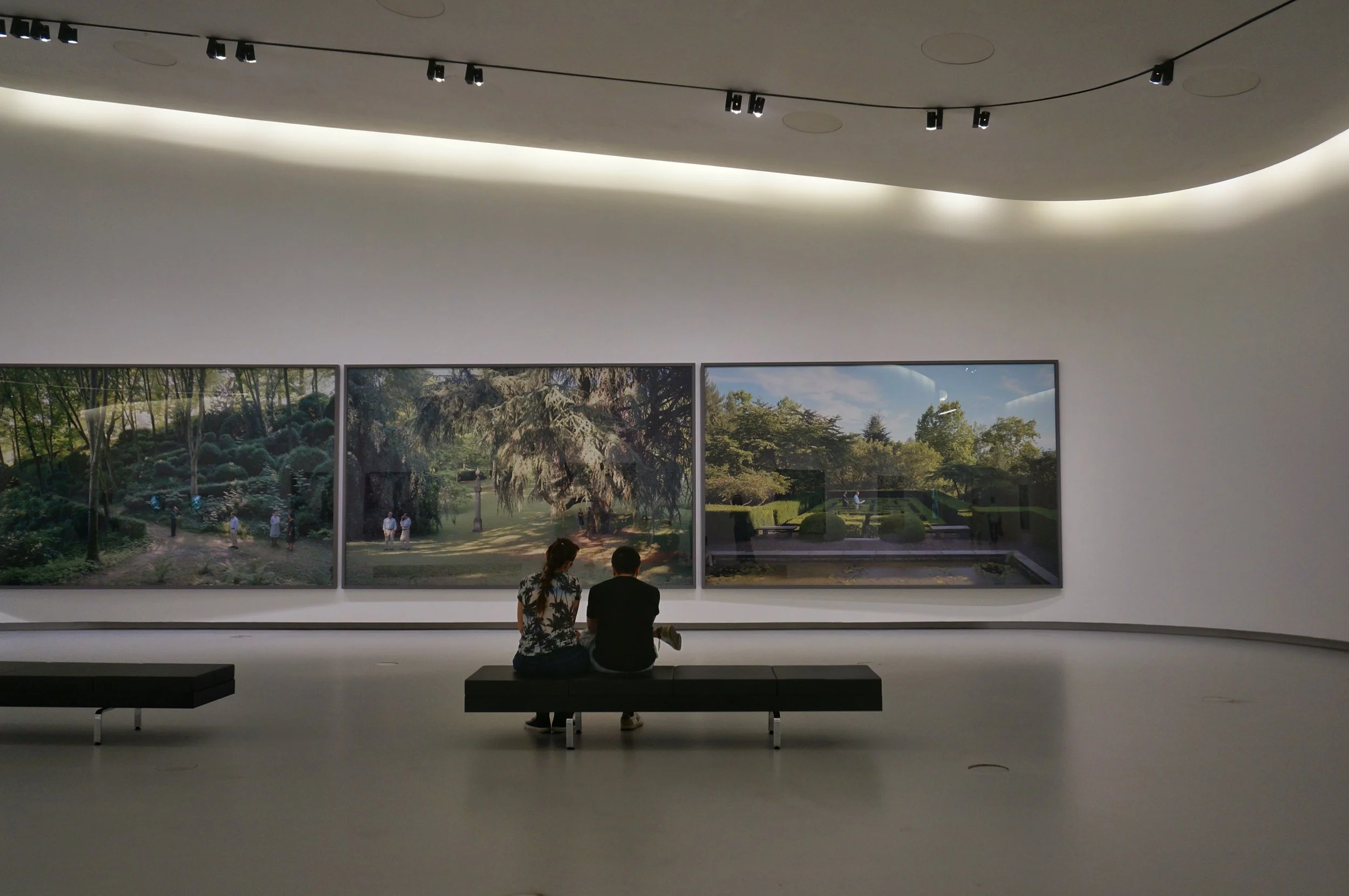
Visit the American Museum of Asmat Art at theamaa.org
American Museum of Asmat Art
The vision for the American Museum of Asmat Art (AMAA) was to amplify its role as a leading teaching collection, while deepening public understanding of Asmat art and culture in alignment with the University of St. Thomas. The museum needed a clear marketing and brand strategy that would bridge its academic roots with broader community engagement.
To shape that vision, we focused on key strategic questions: defining objectives for their marketing, studying how other Minnesota museums approached outreach, and exploring how AMAA’s identity could align with, yet stand distinct from the University of St. Thomas. From there, we mapped out content strategies tailored to both academic audiences and the general public, ensuring the museum could communicate with authority and accessibility.
The outcome is a roadmap for AMAA’s growth that positions the museum as both a scholarly resource and a cultural connector. By clarifying its brand voice and marketing strategy, AMAA is now better equipped to share Asmat art and culture with diverse audiences - from students and researchers to the broader Twin Cities community.


Visit Grow Studio Gardens at growstudiogardens.com.
GROW Studio & Gardens
The vision for Grow Studio & Gardens was to create a digital presence that felt as intentional and nurturing as the physical space itself, a place where design, events, and community could flourish together. The brand needed a website that was not only beautiful but also functional, giving visitors an easy way to explore offerings, book workshops, and connect with the studio’s story.
To shape that vision, I drew inspiration from natural textures, garden palettes, and the balance between structure and organic growth. The design leaned into earthy yet modern typography, clean layouts that let imagery breathe, and an intuitive navigation system that reflects the studio’s emphasis on both creativity and clarity. I also built a scalable Squarespace system with event scheduling, e-commerce integration, and marketing tools so the team could easily manage workshops, product listings, and future growth.
The outcome is a website and brand system that serves as both a digital garden and a functional studio tool. By blending thoughtful design with hands-on usability, Grow Studio & Gardens is now equipped with a platform that cultivates connection, creativity, and community both online and off.

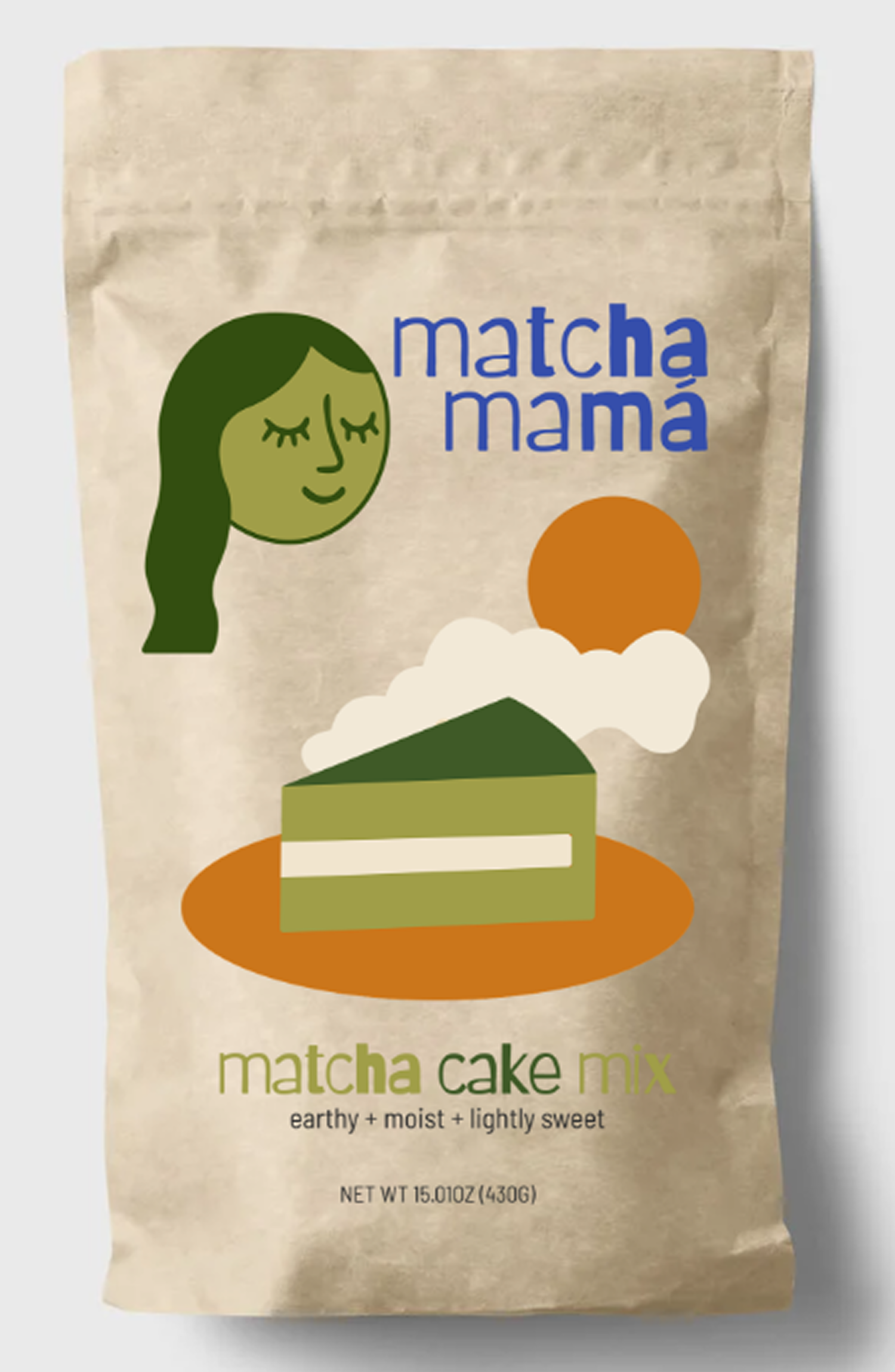


Matcha Mamá
The vision for Matcha Mamá was to create a playful yet grounded brand that captured the earthy joy of matcha while staying approachable for everyday bakers and sippers. Founder Rachael B. was inspired by her trip to Japan and her love of baking, and she wanted a brand identity that would feel as creative and inviting as the recipes themselves.
To shape that vision, I drew inspiration from vintage food packaging, sun-soaked color palettes, and the ritual of slowing down with a warm drink. The illustration style blends a hand-drawn, whimsical feel with bold, graphic shapes, echoing the balance of tradition and play in the product. The typography pairs a clean sans-serif with a more expressive accent, emphasizing the mix of modern accessibility and craft.
The outcome is a visual system that feels warm, earthy, and distinctly playful — from the cookie and drink mix packaging to the brand story itself. By grounding the design in both cultural inspiration and everyday joy, Matcha Mamá is now equipped with a brand identity that brings the gift of matcha to life, one mix at a time.


Jamie Nicole Photography
The vision for Jamie Nicole Photography was inspired by Jamie’s artistry and her desire to launch a business that felt as polished as her work.
To bring that vision to life, we created a brand identity that was both professional and personal, then designed a custom SquareSpace site with clean galleries, detailed packages, and simple booking tools.
The outcome is a cohesive brand and online presence that reflect Jamie’s unique style while making it easy for clients to discover, connect, and book with her.


In the Kitchen with Woody
The vision behind In the Kitchen with Woody came from Sam’s passion for sharing her culinary journey and connecting with others through food.
To capture that passion, we built her identity around her signature color, red - bold and full of energy - softened with warm accents of yellow, blue, and green. This process gave the brand a palette that feels both vibrant and inviting.
The outcome is an identity that mirrors Sam’s personality: confident yet approachable, making her kitchen a space where everyone feels welcome.